
With already over three times the number of mobile phones on the planet than desktop or portable computers, this article The Mobile Web Explained addresses the challenges faced in mobile content delivery during the early days of the Internet, discusses the evolution of mobile web standards, explores the pros and cons of building specific device-based websites, and highlights the future of the mobile web.
Table of Contents
- 1 Challenges in mobile content delivery
- 2 The Birth of WAP (Wireless Application Protocol)
- 3 Early mobile web
- 4 Mobile Web Standards
- 5 DIAL for Device Independence
- 6 Device Recognition
- 7 Industry Standards
- 8 Mobile Website Development Options
- 9 .mobi Domain Controversy
- 10 Building for Specific Devices
- 11 Adaptive Browsers
- 12 Wireless networks
- 13 Emerging Wireless Technologies
- 14 Mobile Browsers
- 15 The future of the mobile web
Challenges in mobile content delivery
Lack of Standards and Divergence
In the early days, the mobile web faced challenges akin to the nascent Internet era. Divergence in platforms and lack of standards resulted in inconsistent web content delivery. Users often encountered poor page layout, cumbersome navigation, and frustrating error scripts.
The Birth of WAP (Wireless Application Protocol)
Facilitating a Richer Experience
Wireless Application Protocol (WAP) emerged as an open protocol suite aimed at improving the mobile web experience. Unwired Planet, founded in 1995, pioneered handset-based Internet access, leading to the creation of the WAP Forum in 1997. The mobile communications industry then committed to WAP, setting the stage for significant advancements.
Early mobile web
WAP (Wireless Application Protocol) was created as an open protocol suite designed to facilitate a richer and more stable user experience for users of mobile devices wishing access to the Web and other services such as email.
High Expectations and Disappointments
Initial expectations for the mobile web were high but fell short due to connectivity issues, hardware and software glitches, and a disconnect between marketing and user needs. The rush to capture market share overshadowed user experience.
Mobile Web Standards
Building a Foundation
WAP 2.0 improved mobile web standards by introducing XHTML (eXtensible Hypertext Markup Language) and CSS (Cascading Style Sheets). The W3C (World Wide Web Consortium) promoted best practices for device manufacturers and developers, emphasizing a transition from desktop to mobile web accessibility.
DIAL for Device Independence
Standardizing Content Presentation
DIAL (Device Independent Authoring Language) proposed by W3C in 2006 aimed to standardize content presentation based on device capabilities. It utilized Media Queries and conditional device-specific branching for efficient content delivery.
Device Recognition
Tailoring Content
The concept of device identification was crucial for delivering content accurately. Various methods, such as WALL, used Java conditional tagging to adapt content to specific devices, ensuring reliability and performance.
Industry Standards
Promoting Interoperability
The Open Mobile Alliance (OMA) was formed in 2002 to establish standards for mobile service providers, fostering interoperability and resolving compatibility issues.
Mobile Website Development Options
Choosing the Right Approach
Developers had several choices for mobile web development. They could create alternate mobile stylesheets, deliver plain HTML sites, or utilize mobile-specific domain names like .mobi.
.mobi Domain Controversy
Streamlining Mobile Content Delivery
In May 2006 the .mobi TLD (Top Level Domain) was released and trademarked companies began registering their websites. By August of the same year, the domain suffix would be thrown open to the public for general domain registration.
The introduction of the .mobi domain divided opinions. While it streamlined mobile content delivery, some criticized it for potentially fragmenting the Web with many in the industry considering the opportunity a threat to the Web as a division of content, encouraging developers to build device-specific content thus splintering the Web. Tim Berners-Lee, head of W3C publicly voiced his dissent:
“I thought the .mobi domain was a bad idea. I still do.”
– Tim Berners-Lee
Nevertheless, W3C is actively working with promoters of DotMobi to standardise the development of websites intended specifically for mobile devices.
Building for Specific Devices
Optimizing User Experiences
Developers could choose to build websites specifically for mobile devices or adapt existing sites. Building device-specific content had its advantages, including optimised user experiences. Websites can be tailored to the mobile environment. Content optimised for small screens. Delivery and interaction will be far swifter without extraneous markup. And, importantly, the user experience will likely be far more enjoyable because the type of content will be geared to user expectations.
Of course, this could all be achieved without building a specific DotMobi site by purposing the site for mobile devices under a .com or other TLD but mobile browsers will likely afford precedence to the domain suffix simply through belief in functionality.
Adaptive Browsers
Leaving Rendering to the Device
The final alternative for developers is to build for the Web and leave the rendering to the mobile device. While this may sound attractive it does present problems, if nothing else with the verbosity level of information delivered.
Both Nokia and Opera Software offer small-screen browsers which provide viewing of websites not specifically written for mobile devices. While this may be innovative (certainly concerning navigation) and in line with the vision of a single device-independent web, it does not address the issue of device nature: delivering content appropriate for use.
Wireless networks
Connecting the dots
Apart from the wireless networks proliferating for mobile phones, other forms of wireless provision were under development and these were mostly concerned with the transmission of information to and from PCs. Contemporary WiFi (Wireless Fidelity) networks using the 802.11 standards run at far higher frequencies (think speeds) than do mobile or cell phone connections, anywhere from 2.4 GHz to 5 GHz.
WiFi networks are currently used to connect PCs to either LANs (Local Area Networks) or directly to the Internet. WiFi hotspots – located at airports, hotels, internet cafes, shopping malls, and business locations – offer reception coverage from an office area to a block or, as overlapping hotspots, for many miles. However, unlike cellular connectivity, WiFi hotspots cannot handover transparently and so do not offer the roaming capabilities available to the majority of current mobile phones.
Emerging Wireless Technologies
Voice over Internet Protocol
But what WiFi does offer, especially for localized business communities, is VoIP (Voice over Internet Protocol), the ability to conduct voice conversations over the Internet or, in fact, any IP-based network, significantly reducing the costs of human telephony, often permitting free phone calls.
VoIP allows users to make and receive calls anywhere in the world provided an internet connection exists – but it does have challenges: ensuring data packets are received in the right order whilst minimising jitter and latency problems causing unnatural pauses and bursts of dialogue. Nevertheless, VoIP will no doubt impact classical telephony as the technical challenges are ironed out, especially once data compression and the new breed of dual-mode handsets penetrate the market allowing both WiFi and cellular connections to be dropped and swapped transparently. Of course, traditional telephony providers will respond to the inevitable revenue losses as VoIP takes hold.
Bluetooth
Bluetooth developed as a 2.4 GHz wireless transmission and arbitration protocol by Ericsson enables a range of devices to communicate with each other over distances of up to about 10 meters. Though of little direct use on the mobile web, Bluetooth-enabled devices can act as a hopper service to WAP-enabled devices.
Nokia, in the same month, released the source code for their S60 mobile browser to encourage take-up by developers but also to capture the existing web market. The browser enables mobile phone users to view existing websites in much the same way as they might on a PC.
Mobile Browsers
Mobile Challenges
Apart from operating systems and web development, 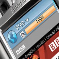 delivering content across the airwaves requires much thought. Several technologies are being developed to surmount problems inherent in the limited bandwidth.
Live transmission (streaming) issues
Live streaming video broadcasts like television or commercial music videos require considerable bandwidth. Current thinking is a realistic rate of 15 frames per second is satisfactory, given the size of most screens but even here it is proving difficult to deliver stutter-free content, especially where users may – by their very nature – not be stationary when receiving content and will hop from one transmission cell to another when, for instance, travelling by train or car.
Other fears concern privilege levels or ‘network neutrality’ of content. Service providers are in hot competition and, with broadcast space at a premium and demand high, must make tactical decisions about what to deliver, where and to whom and, significantly, at what price.
Mobile web browsers
The mobile web or, more specifically, the mobile browsers and devices used to access the mobile internet and other media content is undergoing the state of flux once experienced by the early Web.
Much of the problems arise from the number and diversity of mobile devices available, probably some 50 or more. The platforms of computing quickly evolved into two camps: IBM-type PCs and the Apple Macintosh range of personal computers. Equally speedily two operating systems established themselves, Windows and Mac OS for the respective architectures. There is no denying the different flavours of each presented challenges to developers as the OS browsers matured and were replaced leading to quirks requiring a little fudging for earlier versions but the trend was towards consistency of operation based upon W3C standards.
The future of the mobile web
As discussed earlier, the Web will go mobile, if for no other reason than the number of mobile handsets in worldwide circulation. This presents challenges for the classical desktop web because it represents a threat to the division of content by a demarcation of mobile and non-mobile websites.
The mobile device and service provider industry – cell phone, PDA and wireless deliverers, in other words, handheld devices and providers – is in a state of both flux and consolidation.
COPE
A media bill passed on June 8, 2006, by the US House of Representatives called the Communications Opportunity, Promotion, and Enhancement Act (COPE) has effectively offered internet and telecommunications companies the opportunity to degrade or impair user services as they see fit by abandoning a regulatory amendment. In other words, they can discriminate web and content access to users as they see fit.
Network (cable and phone) companies can decide what type of content and from whom can be carried across their networks.
And because of the limited bandwidths currently available profitability decisions will determine the type and quality of traffic available to users.
To further complicate matters, users will likely enter into a contract in the same way they do for standard mobile phone usage to receive web services or indeed connect to the Internet.
And because of the limited bandwidths currently available profitability decisions will determine the type and quality of traffic available to users.
Mobile web servers
Nokia developed the idea of ‘Mobi-Sites' in 2004 with their Mobile Web Server project. From a traditionalist perspective, the concept is interesting, to say the least. A fully-fledged server on which resides a website ready to deliver location-specific content.
- Understanding social networking on mobile phones
Imagine a roving reporter. They are location-specific, they make a report on their experiences in a particular venue, incident or holiday resort. Their content is then tagged and when an individual enters the report province they are presented with an automatic update alert on their mobile device. Locale-specific delivery is a prime candidate for mobile devices, notably when those individuals have immediate access to content; in other words, their mobile device is equipped with a server.
In conclusion
The mobile web is an inexorable trend which embraces the Web but, inherently, represents grave challenges and opportunities to content neutrality. Sir Tim Berners-Lee (founder and chairperson of W3C) constantly emphasizes neutrality of delivery but whether this remains a viable vision is questionable.
The mobile web is a lucrative sector for service providers and content creators, many of whom will unlikely care for constraints of delivery based upon standards when they might garner substantial revenue for any method which delivers content.
Citations
The Mobile Web Explained, Published 2008 by Sonet Digital.


